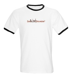
Another thing to keep in mind is that I am considering changing the overall color scheme of this site from orange/brown to shades of blue – the logo will be modified when that happens. Again, the logos are in no specific order, but having seen them on potential merchandise, I have made a few comments on each one. Logo Entry 1
I like this one because the circular part of the design can be used separately or with the words. It stands out on the clothing and could be modified to put the text on the right for the top of the website.
Logo Entry 2
I like the modern funky style of this one but I am a little concerned that it does not show too well on merchandise. It would be good for the top of the site – but I would need some convincing for apparel. Logo Entry 3
Like number 1, the circular section could be used separately. I am just not sure if the smiley face would be recognized as our own – whereas the image in entry 1 is distinct.
Logo Entry 4
This was one of my favorites in the top 12, but seeing it on merchandise does tend to remind me of a corporate logo – the sort of thing you would see a dozen men on a company golf team wearing. Logo Entry 5
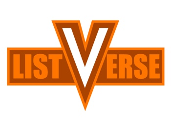
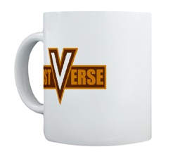
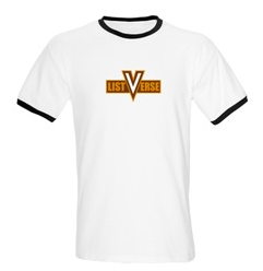
This one has great impact and the V could be extracted if needed. It is distinct and I think it has a very modern/retro appeal to it. Read More: Twitter Facebook YouTube Instagram
