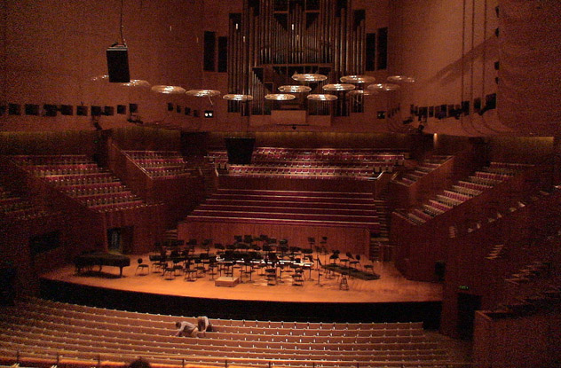
10Sydney Opera House The Worst Sound In The World
Like billowing sails out on the harbor, the iconic Sydney Opera House has become a symbol of Australia as much as the kangaroo. Danish architect Jorn Utzon’s design was revolutionary in 1957, when it won an international competition. It was originally planned to contain a large hall for opera and a smaller theater for concerts and drama. But after nine years of construction, quarrels with the conservative government of New South Wales over costs forced Utzon out of the project. The local architects hired to finish the job completely switched the functions of the hall and theater, resulting in an auditorium that is too small for opera and a concert hall that is way too big. This was understandable at the time, when symphonies drew in more people than opera. But today, the Concert Hall has 1,000 seats too many, while the Opera Theater’s pit is so small, musicians have difficulty coordinating their performance. Meanwhile, sound tends to dissipate in the cavernous Concert Hall, once prompting a boycott by the chief conductor of the Sydney Symphony Orchestra. It’s like watching performances on an ’80s-era TV set, and you may want to turn up the volume if you are sitting at the back. A poll of musicians, critics, and audience members rated the Opera Theater as having the worst acoustics out of 20 major venues. The Concert Hall was ranked 18th. The government is now faced with the possibility that the building will soon be functionally obsolete unless it is raised to 21st-century standards. Already, a major performance of Richard Wagner’s Ring Cycle passed over Sydney in favor of Melbourne’s Art Center. The renovation is estimated to cost a staggering AUD 825 million (USD 775 million).
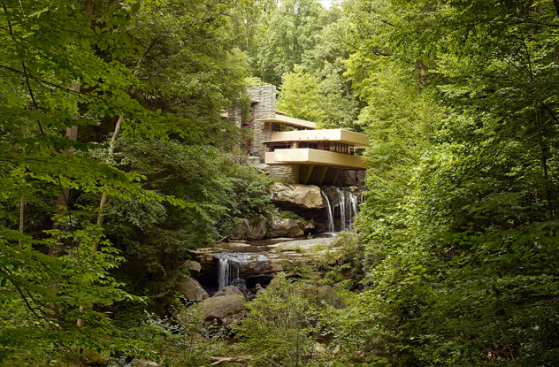
9Fallingwater A Collapsing Disaster
Nature lover Edgar Kaufman was surprised when architect Frank Lloyd Wright showed him the designs for his dream house. Kaufman had wanted a house with a view of the falls at Bear Run stream in western Pennsylvania. Wright presented him with a daring design of a house on top of the falls. It is one of the finest examples of a man-made structure blending in with the natural environment. However, beneath the breathtaking facade, Fallingwater was a structural nightmare. Construction began in 1936, and Kaufman bought in consulting engineers to double-check Wright’s design. The engineers thought the beams supporting the living room should have more reinforcing steel. Wright’s massive ego refused to admit to any shortcomings with his design. Workers inserted additional reinforcing steel anyway without Wright’s approval and permission, opening a rift between Wright and Kaufman. When the house was finished in 1939, the floor was already sagging by 4.5 centimeters (1.75 in) despite the added reinforcement. By 1995, it had gone down almost 20 centimeters (7 in), and cracks were widening. Tests ominously showed the concrete being stressed to 95 percent of its failure strength. Fallingwater was falling down. It was a miracle that it had even held up as long as it had. Engineers rushed to fix the beams that hold the house up. An entire secondary structural system now relieves the stresses on the old girders. The repairs cost around $11 million, but they ensured that Wright’s masterpiece will continue to impress for years to come.
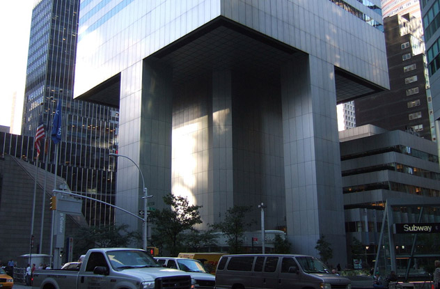
8Citicorp Center A Building Set To Topple
Citicorp Center in midtown Manhattan was the seventh-tallest skyscraper in the world when it was built in 1977. The 59-story building is instantly recognizable by its 45-degree angled top—and by its stilts. Citicorp Center rests seemingly precariously on nine-story stilts. This unusual design was an accommodation to St. Peter’s Lutheran Church, which occupied the corner of the building lot. Rather than move elsewhere, St. Peter’s insisted that Citicorp build a new church on the same spot. A further condition was that the proposed skyscraper could not encroach on church grounds, though they could build on the airspace above. Engineer William LeMessurier conceived of stilts to avoid the church and cantilever the building over it. By necessity, the stilts were not on the corners of the building, where they could have been more stable, but at the midpoint of its sides. It was an odd but apparently sound solution—until its weakness was discovered, entirely by accident. Engineering student Diane Hartley called the LeMessurier company to ask technical questions on the safety of the design. Hartley was particularly concerned about the effect of quartering winds, or winds that strike a building at its corners. Since Citicorp had no stilts at its corners, might it not be vulnerable? LeMessurier assured her that the framework could resist even the strongest winds. But after the interview, they began having second thoughts. During construction, LeMessurier had used bolts instead of welds to secure many of the building’s joints. It was normally an innocuous change, but this was not a normal building. Doing the math again, the company was appalled to discover that Hartley was right—112-kilometer-per-hour (70 mph) gusts could overwhelm the bolts, and Citicorp could topple in the wind. The death toll would be unimaginable. With hurricane season fast approaching, there was no time to lose. In utmost secrecy so as not to alarm the public, emergency repair crews swarmed the building by night, welding all the joints. It helped that New York City’s newspapers were on strike at the time. Hurricane Ella was already moving up the coast, and evacuation plans covering a 10-block radius were prepared in case the unthinkable happened. It was a relief when Ella veered away, and the repairs were done by September 1978. It was touch-and-go, and the world didn’t know anything about it until 1995, when it was featured in an article in the New Yorker. As for Diane Hartley, she never knew she had saved hundreds, if not thousands, of lives with her phone call, until she saw a special on the crisis aired by the BBC.
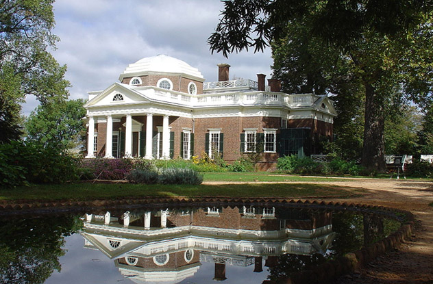
7Monticello A Cramped Deathtrap
Thomas Jefferson broke architecture’s cardinal rule in building Monticello: Form follows function. Jefferson put aesthetics ahead of comfort in his plan. While most plantation houses were built on riverbanks for easy access, Jefferson built Monticello, south of Charlottesville, Virginia, on a mountaintop—hence its name, which is Italian for “Little Mountain.” The site is grand and majestic, but it came with a cost. First of all, construction slowed. Once the residence was completed, the well lacked enough water to supply it, and Jefferson had to haul water up the mountain from the nearby springs. Jefferson’s family grumbled about the discomfort of living in cramped rooms. His daughter, Martha Randolph, particularly disliked the alcove beds, boxed in on three sides, that Jefferson had designed to save space. The most impressive feature of Monticello, the domed room, serves no function whatsoever. It is unheated and lacks easy access and proper ventilation. But the most serious design flaw in the house are the dark, narrow, steep, and twisting stairs, which are accidents waiting to happen. Jefferson thought stairs in general eat up a lot of space, particularly the grand, sweeping staircases common in similar residences. At 188 centimeters (6’2”), Jefferson could tackle the steep steps easily. Besides, he rarely used them as he confined himself mostly on the first floor. But they were a daily ordeal for shorter people, women with wide skirts, or servants burdened with laundry. Even today, tour guides advise less agile visitors to cope with the stairs by going down backward.
6Versailles Palace A Stinking Mess
Louis XIV of France determined to build himself a palace befitting his status as the Sun King. With its 700 rooms, 67 staircases, soaring painted ceilings, and marbled hallways, Versailles fulfilled that vision. Today’s visitors will be surprised to learn that this majestic estate was once a stinking, dirty place you’d rather not enter, let alone live in. Versailles was built without proper toilets. People had to handle their bodily functions wherever they could. That was a huge problem back in the day, when Versailles, from the gardens to the royal apartments, was open to the public. Courtiers and royalty did their business using portable decorative commodes or by stealing away under cover of darkness out to the gardens. The waste from the commodes was simply tossed out of windows. Two princesses accompanying Queen Marie Antoinette on a stroll in the courtyard once suffered a drenching from one of the windows. The common folk, as well as the royal dogs, took to relieving themselves in hallways and staircases. The unbearable odor clung to clothes, undergarments, and even wigs. The servants did not consider hauling out waste as part of their duties. Just around the time of Louis XIV’s death in 1715, a rule came out requiring the corridors to be cleared of feces once a week. Only in 1768—144 years after the palace was built—did some bright fellow think of adding toilets.
5Washington Monument Almost A Leaning Tower
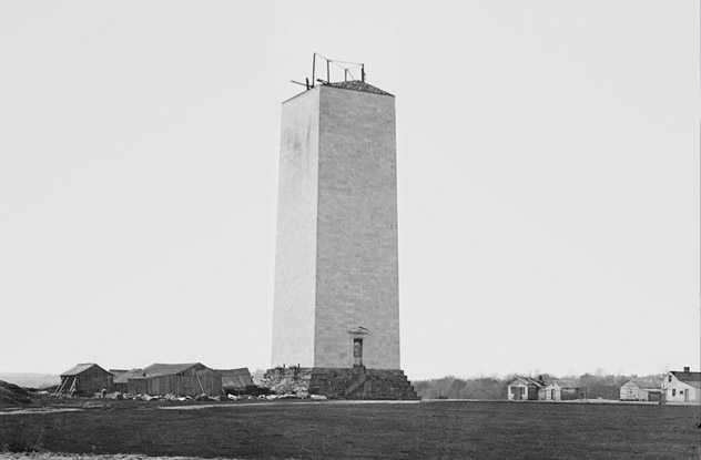
The Washington Monument was envisioned to be the tallest masonry obelisk in the world, a fitting tribute to the Father of His Country. It was originally conceived as a 180-meter (600 ft) flat-topped pillar encased in marble, ringed at its base by a circular colonnade. A sculpture of Washington on a chariot would adorn its roof. The structure was severely compromised from the beginning. The shaft rested on a foundation measuring only 7 square meters (80 sq ft). It exerted nearly 500 kilopascals (10,000 lb/sq ft) of pressure on a bed of clay and fine sand. As a result, the shaft began to lean 4 centimeters (1.7 in) out of the vertical and began to crack while construction was only one-third complete. It looked like America was creating a national disgrace and an international embarrassment with its Leaning Tower. And at least the bell tower of Pisa was an aesthetic marvel—America only had a plain pillar with its top chopped off to show for her efforts. Construction was stopped in 1856 from lack of funds, support, and direction. In 1876, after years of neglect, Col. Thomas Casey of the US Corps of Engineers received the task of strengthening and completing the monument. Remodeling the aesthetic aspects of the structure, such as eliminating the ostentatious colonnade and topping the shaft with a pointed pyramidion, was the easy part. Thus streamlined, the monument now resembled a sleek Egyptian obelisk. More challenging was doubling the footing and pushing it deeper to a solid stratum of boulders and gravel. Col. Casey solved all the difficult technical problems, and the Washington Monument was saved. It was officially dedicated on February 21, 1885.
4John Hancock Tower Exploding Windows
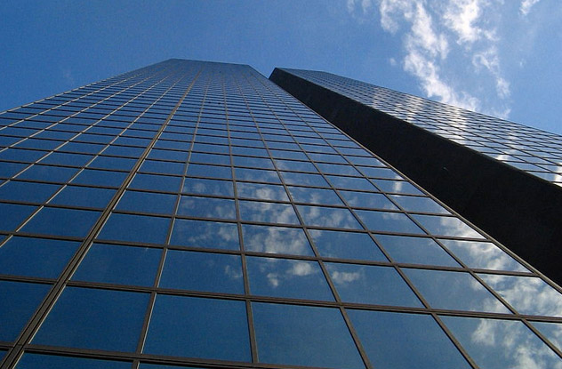
Skyscrapers with all-glass facades are so routinely built today that we take them for granted. But in the ’70s, a building sheathed completely in glass was revolutionary, and Boston’s 240-meter (790 ft) John Hancock Tower was one of the pioneers in this innovative design. A glass facade saves energy by letting in as much sunlight as possible while reflective panels turn away heat. Hancock Tower, the tallest in Boston, was wrapped with 10,344 panes of the special glass. It was dazzlingly beautiful—until the windows began popping out, raining murderous glass shards on the street below. Speculation blamed either the wind or the shape of the building. There was more bad news. A Swiss engineer discovered a dangerous sideways motion as the skyscraper was buffeted by winds. Hancock Tower could topple over. The swaying problem was solved by installing two 270-metric-ton (300 ton) counterweights. But the exploding windows still defied explanation. By this time, an acre-size area of missing windows had to be boarded up with plywood, and Bostonians jokingly referred to the Tower as the “Plywood Palace.” The mystery was solved upon closer examination of the glass. The windows were double-paned, with a layer of lead between the panels. Lead expands when heated and contracts when cooled. The alternating thermal expansions and contractions caused by the heat of the day and cool of night produced stresses within the glass, which caused them to shatter. For an additional cost of $7 million and a five-year delay, all the windows at Hancock Tower were replaced. Builders took the lessons of John Hancock Tower to heart. Today, they use flexible silicone instead of lead or other metals sensitive to heat, ensuring that none of us have to look up in anxiety whenever we pass by a glass skyscraper.
3Golden Gate Bridge Corroded Suicide Magnet
Many people originally thought we could never build a suspension bridge across San Francisco Bay. It would have to be light enough to hang from cables yet durable enough to withstand high winds and earthquakes. Today, the Golden Gate Bridge dominates the bay, remarkably resilient throughout its history of close calls. The bridge was nearly destroyed in 1951, when wind gusts close to 112 kilometers (70 miles) per hour struck, twisting the bridge. Just nine years earlier, the Tacoma Narrows Bridge in Washington had broken apart with winds half that strength, and now the Golden Gate looked like it might meet the same fate. Fortunately, it held, but the experience revealed that the stiffening protective trusses needed lateral bracing to stabilize them. More serious was the flaw in the original design that allowed water to collect where vertical cables meet the bridge deck. The problem was exacerbated by San Francisco Bay’s famous damp fog, a major enemy of structural steel. An inspection in the 1970s showed so much corrosion that the suspender cables could be picked apart by a knife. The problem was so serious that engineers had to replace all 500 cables. The repairs will make the bridge last, with proper maintenance, for another 150 years. The bridge’s structural shortcomings were all caught before they took any lives. The same can’t be said for a more elementary defect. The bridge’s original design specified a high railing along the walkways to prevent suicides. But builders decided late to lower the railing to enhance the view. As a result, the Golden Gate Bridge is a magnet for suicides and even murders. Since 1937, the city has recovered 1,600 bodies from the bay below the bridge, with presumably many more victims undetected. In 2008, a stainless steel net stretching 6 meters (20 ft) below the walkways was proposed as a deterrent.
2Beauvais Cathedral Repeated Collapses
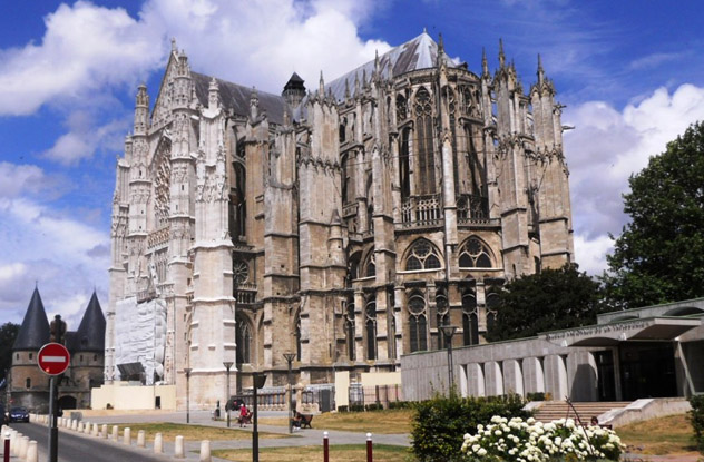
Commissioned in 1225, the Cathedral of St. Pierre de Beauvais in northern France was an ambitious attempt to build the highest Gothic cathedral in the world. Somehow, architect Bernard de Soissons miscalculated the strength of his design. The choir was completed in 1272 with a record-breaking height of 47 meters (154 ft). But in 1284, the room mysteriously collapsed. No one knows why. The determined locals rebuilt the cathedral, adding more columns. Over 200 years later, a transept was constructed with a soaring 153-meter (500 ft) tower with supporting vaults. During a service on Ascension Day 1573, the tower came crashing down. The disaster discouraged further attempts at rebuilding, and the nave was never built. Today, the “Parthenon of French Gothic” remains unfinished and is listed in the World Monuments Fund’s 100 Most Endangered Sites. Despite this, it’s a magnificent building, and engineers are desperately trying to understand its structural flaws and find ways to save it. Miraculously, it survived the bombings of World War II. The threat today is gale-force winds from the English Channel, 160 kilometers (100 mi) away. The winds put heavy stress on the flying buttresses, which in turn weakens the roof framing. A tie-and-brace system of metal and wood supports shakily prop up the church until architects and engineers can figure out a more permanent solution. To do that, a team from Columbia University scanned the entire cathedral with a laser, producing 75 digital images, each one containing about a million data points. This enabled scientists to create a digital replica of the structure on which they can perform a series of tests and structural analyses to pinpoint exactly where the weaknesses lie. Ongoing restoration work is guided by the results from these studies. Perhaps one day, Beauvais Cathedral will finally have its nave and tower.
1Taj Mahal Thrown Off-Balance
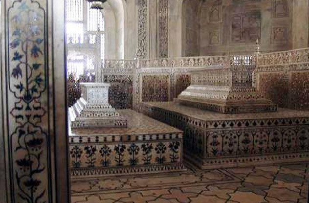
The ultimate monument to undying love, the Taj Mahal in Agra, India is a dreamlike structure built by emperor Shah Jahan as a tomb for his beloved wife Mumtaz. From the Persian-inspired “charbagh” or “four-garden” layout to the equidistant minarets flanking the main building with the central tomb, it is a masterpiece of architectural symmetry. Yet, walk inside, and something odd meets the eye. Mumtaz’s tomb aligns perfectly with the main entrance and lies at the exact center of the chamber. But beside it on the right, incongruously larger, higher, and evidently out of place, is the tomb of Shah Jahan himself. If it looks like it was stuck there as an afterthought, that’s because it was. Blame Shah Jahan’s son, Aurangzeb, for this aesthetic insensitivity. It is said that Aurangzeb, a devout Muslim, did not permit the kind of ostentation at death disapproved of in the Quran. So instead of building a separate mausoleum for his father, Aurangzeb simply squeezed in his tomb next to his mother’s. Legend also says that Islamic tradition dictated that a husband’s tomb must be to the right of his wife and facing Mecca. Whatever Aurangzeb’s motive, he permanently ruined the perfect symmetry of this beautiful mausoleum complex. My hobbies are history and chess, and they have nothing to do with my dropping out of architectural college.
